一、实验目的
1.熟悉Metropolis_Hastings的基本原理,以及算法流程,掌握用python代码实现Metropolis_Hastings抽样。
2.在Metropolis的基础上,了解它的几个变种,本实验以随机游动的Metropolis为例,掌握用python代码实现随机游动的Metropolis抽样。
3.掌握适用于高维分布的Gibbs采样,了解其算法流程,掌握用python代码实现Gibbs采样。
二、实验内容及步骤(包括问题,代码,结果和结论)
2.1 Metropolis_Hastings
题目:

代码:
首先,我们导入所需的库
import numpy as np
import scipy.stats as st
import matplotlib.pyplot as plt
下面我们产生sigma=4的瑞利分布随机数,使用的提议分布为gamma分布
def Metropolis_Hastings(m, f, g, sigm):
    k = 0
    x = np.zeros(m)
    u = np.random.rand(m)
    x[0] = g.rvs(1, scale=1)
    for i in range(1, m):
        xt = x[i-1]
        y = g.rvs(a=xt, loc=0, scale=1)
        num = f.pdf(y, scale=sigm) * g.pdf(xt, a=y, loc=0, scale=1)
        den = f.pdf(xt, scale=sigm) * g.pdf(y, a=xt, loc=0, scale=1)
        if u[i] <= min(num / den, 1):
            x[i] = y
        else:
            x[i] = xt
            k += 1
    print('reject probablity: ' + str(k / m))
    return x
m = 10000
burn = 1000
sigm =  [0.05, 0.5, 1, 2, 4, 16]
f = st.rayleigh
g = st.gamma
# y = g.rvs(a=1, loc=0, scale=1)
x = Metropolis_Hastings(m, f, g, sigm[4])
运行结果:

大约30%的候选点被拒绝了,因此这个方法产生链的效果可以
下面生成瑞利分布由M-H算法产生的样本路径图
def TracePlot(x):
    dataX = np.arange(1, x.shape[0]+1)
    dataY = x
    plt.figure(figsize=(12, 5))
    plt.plot(dataX, dataY, linewidth=0.4, color="red")
    plt.title("Trace Plot", fontsize=20)
    plt.xlabel("Index", fontsize=12)
    plt.ylabel("x", fontsize=12)
    plt.savefig("2-TracePlot.png", dpi=200)
    plt.show()
TracePlot(x)
运行结果:
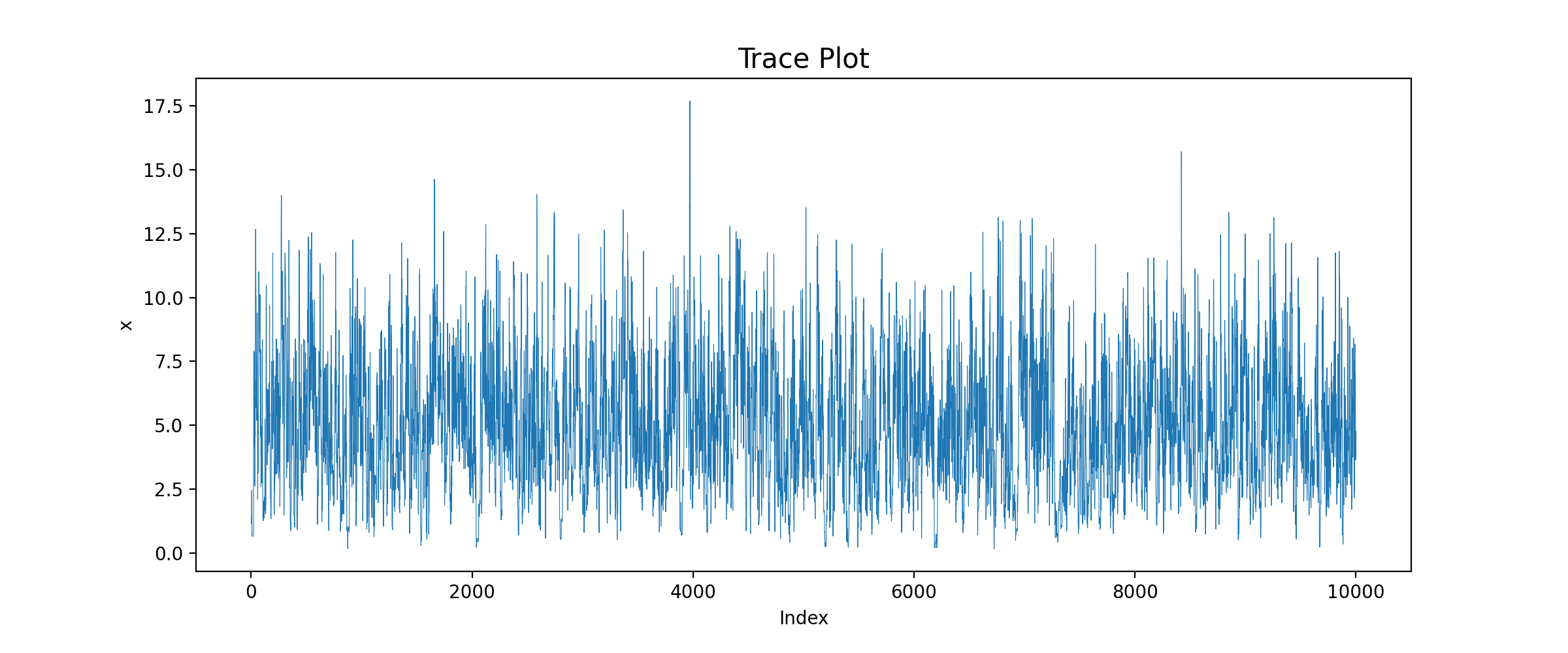
由图可知,在候选点被拒绝的时间点上链没有移动,因此图中有很多短的水平平移。
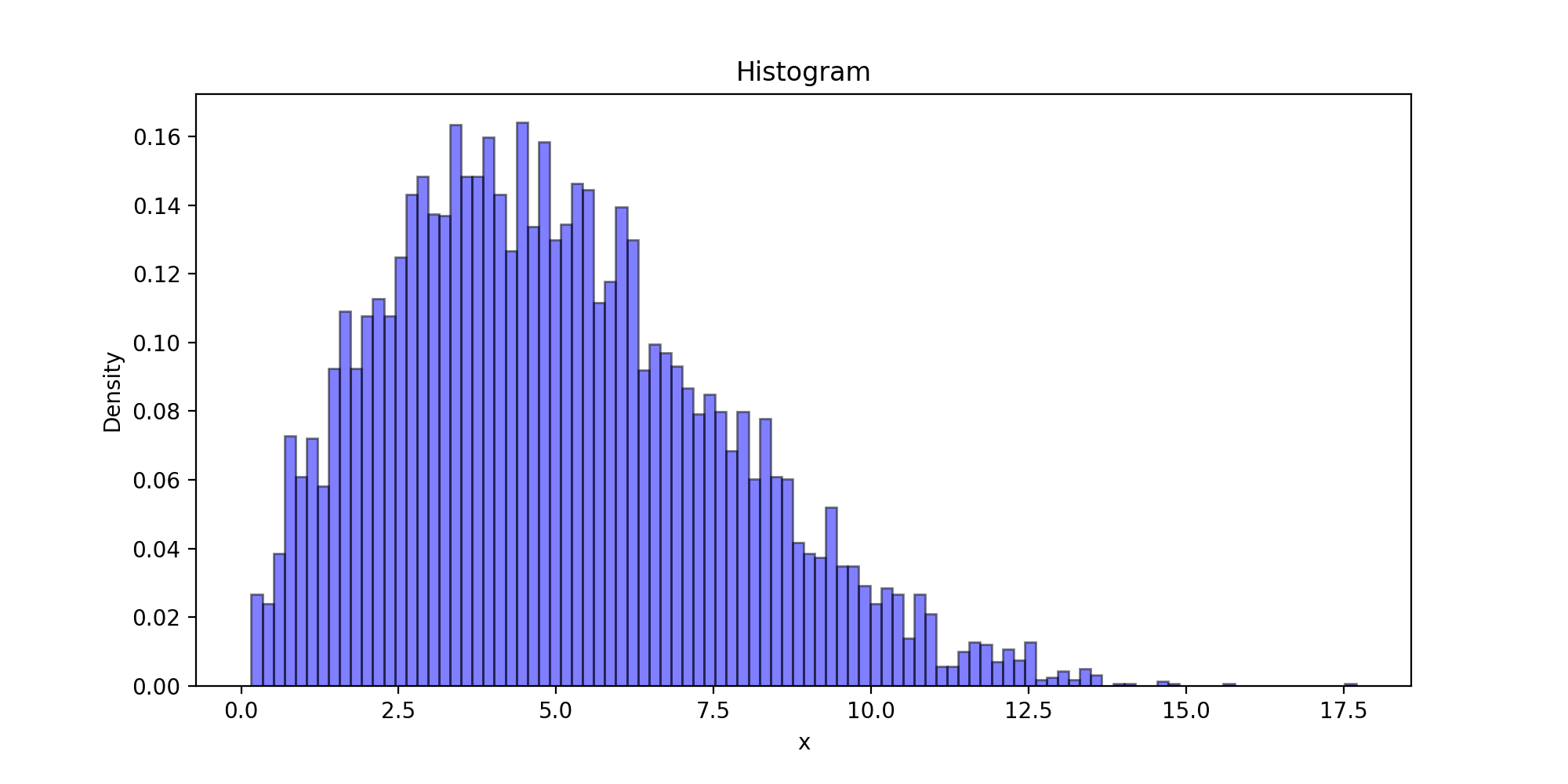
下面以瑞利分布为目标分布的链生成样本的直方图
def Histogram(x, burn):
    x = x[burn:]
    plt.figure(figsize=(10,5))
    plt.title("Histogram")
    plt.xlabel('x')
    plt.ylabel('Density')
    plt.hist(x, bins=100, color="blue", density=True, edgecolor="black", alpha=0.5)
    #bins:直方图柱数 density:布尔值。如果为true,则返回的元组的第一个参数n将为频率而非默认的频数 alpha:透明度
    plt.savefig("2-Histogram.png", dpi=200)
    plt.show()
Histogram(x, burn)
运行结果:
下面以瑞利分布为目标分布的链生成样本的密度函数曲线图以及理论密度函数曲线图
def Distribution(x, burn, f):
    x = x[burn:]
    tick = np.arange(x.min(), x.max(), 0.001)
    plt.plot(tick, f.pdf(tick), color="red")
    p, y = np.histogram(x, bins=100, density=True)
    #x: 待统计数据的数组 bins:指定统计的区间个数 density为True时,返回每个区间的概率密度;为False,返回每个区间中元素的个数
    y = (y[:-1] + y[1:])/2
    plt.plot(y, p, '--b')
    plt.title('Distribution')
    plt.legend(['theory', 'sample'])
    plt.xlabel('x')
    plt.ylabel('Density')
    plt.savefig("2-Distribution.png", dpi=200)
    plt.show()
Distribution(x, burn, f)
运行结果:
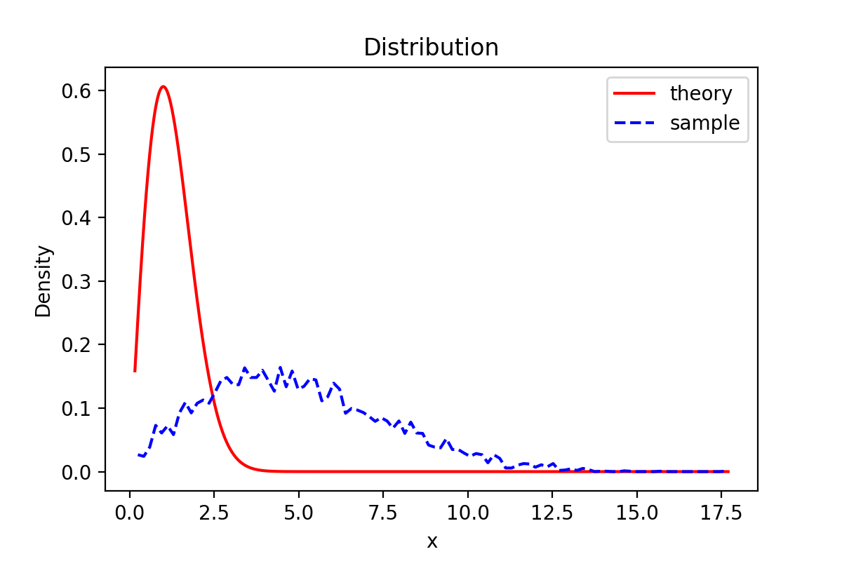
由图可知,样本密度函数图与理论函数密度图有一定偏差。
下面的代码获得比较瑞利分布的理论分位数和生成链的分位数拟合程度的QQ图
def QQPlot(x, burn, scale):
    x = x[burn:]
    x.sort()
    y = st.rayleigh.rvs(scale=4, size=x.shape[0])
    y.sort()
    quantileX = [np.percentile(x, i) for i in range(101)]
    quantileY = [np.percentile(y, i) for i in range(101)]
    '''
    x: 输入数组 q: 要计算的百分位数,在 0 ~ 100 之间
    第 p 个百分位数是这样一个值,它使得至少有 p% 的数据项小于或等于这个值,且至少有 (100-p)% 的数据项大于或等于这个值。
    '''
    print('样本的50%分位数: {}'.format(quantileX[50]))
    print('理论值的50%分位数: {}'.format(quantileY[50]))
    plt.scatter(quantileY, quantileX, c='blue') #散点图
    plt.xlabel('rayleigh')
    plt.ylabel('Sample Quantitiles')
    plt.savefig("2-QQPlot.png", dpi=200)
    plt.show()
QQPlot(x, burn, sigm[4])
运行结果:
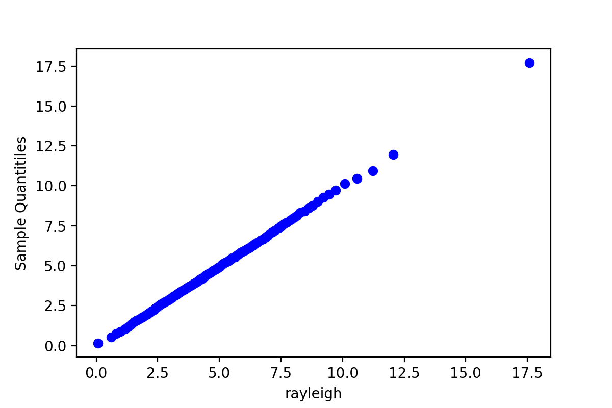
QQ图是判断由链产生的样本分位数和目标分布的理论分位数拟合好坏的一种方法,由于QQ图上的点基本上集中在一条直线附近,这显示样本分位数和理论分位数是高度近似一致的。
2.2 随机游动的Metropolis
题目:

首先,我们导入所需的库
import numpy as np
import scipy.stats as st
import matplotlib.pyplot as plt
生成链的代码如下
def RandomMetropolis(m, f, g, x0, scale):
    k = 0
    np.random.rand(0)
    x = np.zeros(m)
    u = np.random.random(m)
    x[0] = x0
    for i in range(1, m):
        xt = x[i-1]
        y = g.rvs() + xt
        num = f.pdf(y)
        den = f.pdf(xt)
        if u[i] <= min(num / den, 1):
            x[i] = y
            k += 1
        else:x[i] = xt
    print('acceptance rate: ' + str(k / m))
    return x
m = 10000
burn = 1000
sigm = [0.05, 0.5, 2, 16]
f = st.laplace
g_0 = st.norm(scale=sigm[0])
g_1 = st.norm(scale=sigm[1])
g_2 = st.norm(scale=sigm[2])
g_3 = st.norm(scale=sigm[3])
# g_4 = st.norm(scale=sigm[4])
# g_5 = st.norm(scale=sigm[5])
x_0 = RandomMetropolis(m, f, g_0, 0, scale=sigm[0])
x_1 = RandomMetropolis(m, f, g_1, 0, scale=sigm[1])
x_2 = RandomMetropolis(m, f, g_2, 0, scale=sigm[2])
x_3 = RandomMetropolis(m, f, g_3, 0, scale=sigm[3])
# x_4 = RandomMetropolis(m, f, g_4, 0)
# x_5 = RandomMetropolis(m, f, g_5, 0)
运行结果:

只有第三个链的拒绝概率在区间[0.15,0.5]之间
下面生成不同sigma值下的样本路径图
def TracePlot(x, order):
    dataX = np.arange(1, x.shape[0]+1)
    dataY = x
    plt.figure(figsize=(12, 5))
    plt.plot(dataX, dataY, linewidth=0.4, color="red")
    plt.title("Trace Plot,sigma={}".format(sigm[order]), fontsize=20)
    plt.xlabel("Index", fontsize=12)
    plt.ylabel("x", fontsize=12)
    plt.savefig("6-{}-TracePlot.png".format(order), dpi=200)
    plt.show()
TracePlot(x_0, 0)
TracePlot(x_1, 1)
TracePlot(x_2, 2)
TracePlot(x_3, 3)
运行结果:

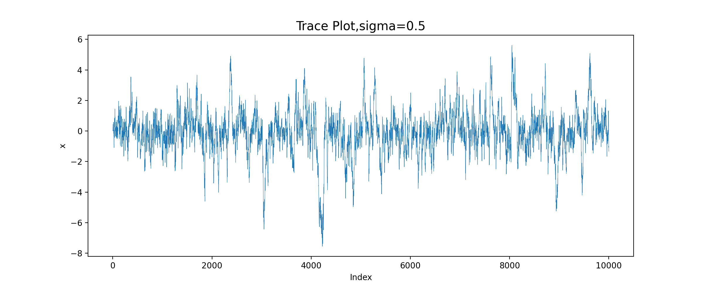

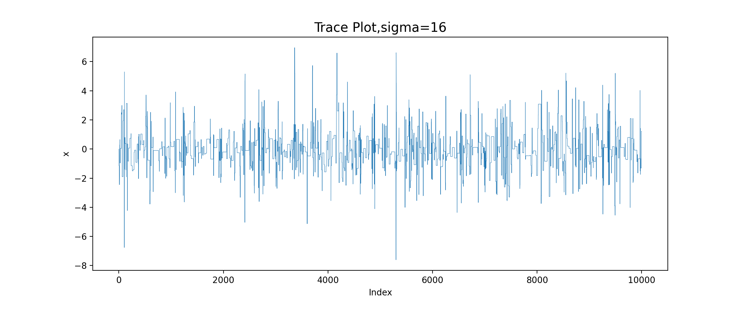
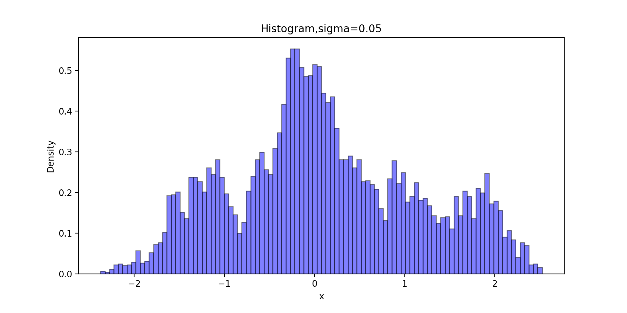
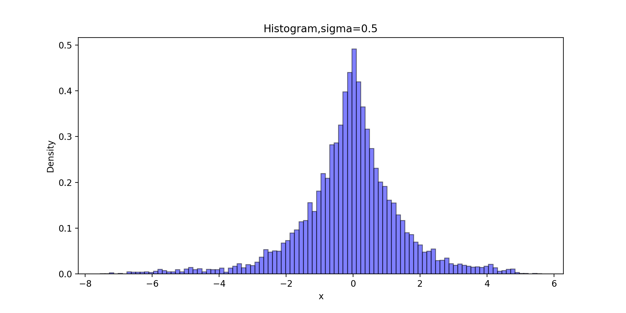
由图可知,sigma=0.05时,增量太小,几乎每个候选点都被接收了,链在2000次迭代之后还没有收敛;sigma=0.5时,链的收敛性慢;sigma=2时,链很快收敛;而当sigma=16时,接受的概率太小,链虽然收敛了,但是效率很低。
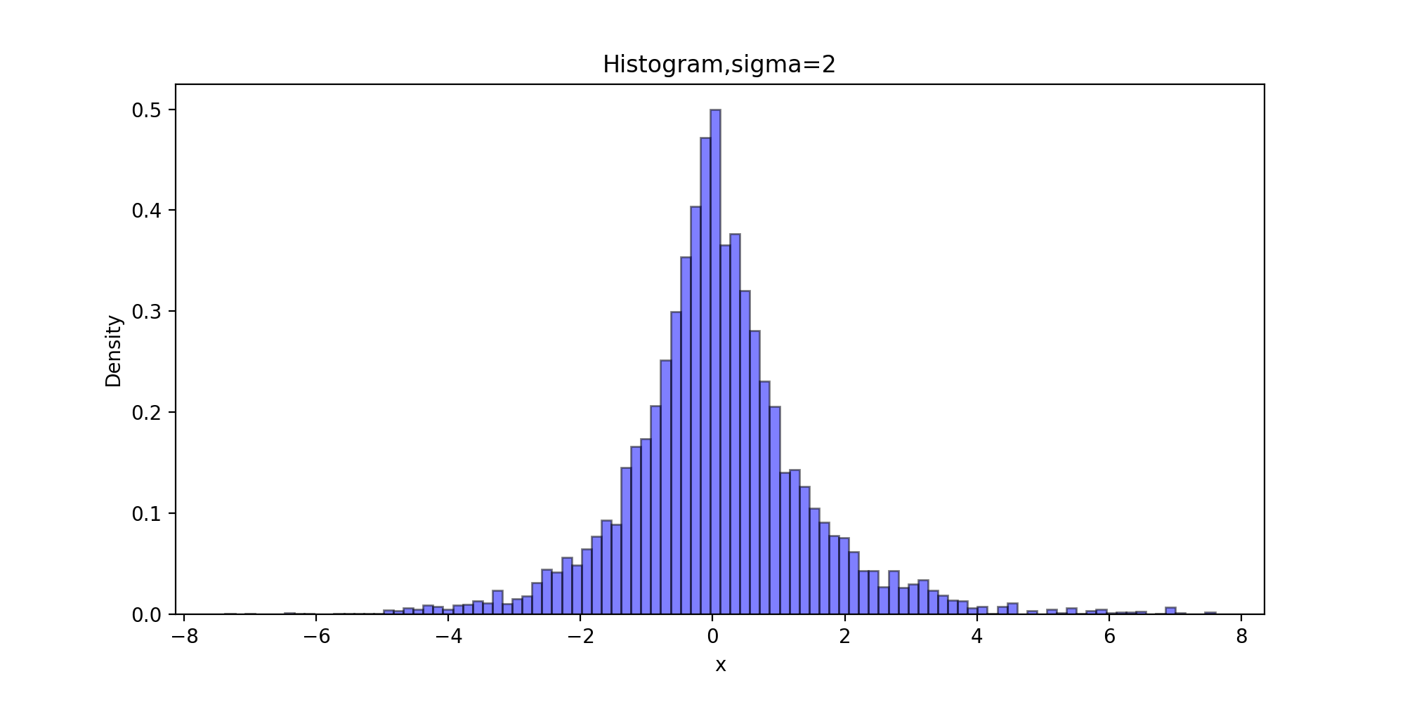
下面以拉普拉斯分布为目标分布的链生成样本的直方图
def Histogram(x, burn, order):
    x = x[burn:]
    plt.figure(figsize=(10,5))
    plt.title("Histogram,sigma={}".format(sigm[order]))
    plt.xlabel('x')
    plt.ylabel('Density')
    plt.hist(x, bins=100, color="blue", density=True, edgecolor="black", alpha=0.5)
    #bins:直方图柱数 density:布尔值。如果为true,则返回的元组的第一个参数n将为频率而非默认的频数 alpha:透明度
    plt.savefig("6-{}-Histogram.png".format(order), dpi=200)
    plt.show()
Histogram(x_0, burn, 0)
Histogram(x_1, burn, 1)
Histogram(x_2, burn, 2)
Histogram(x_3, burn, 3)
运行结果:
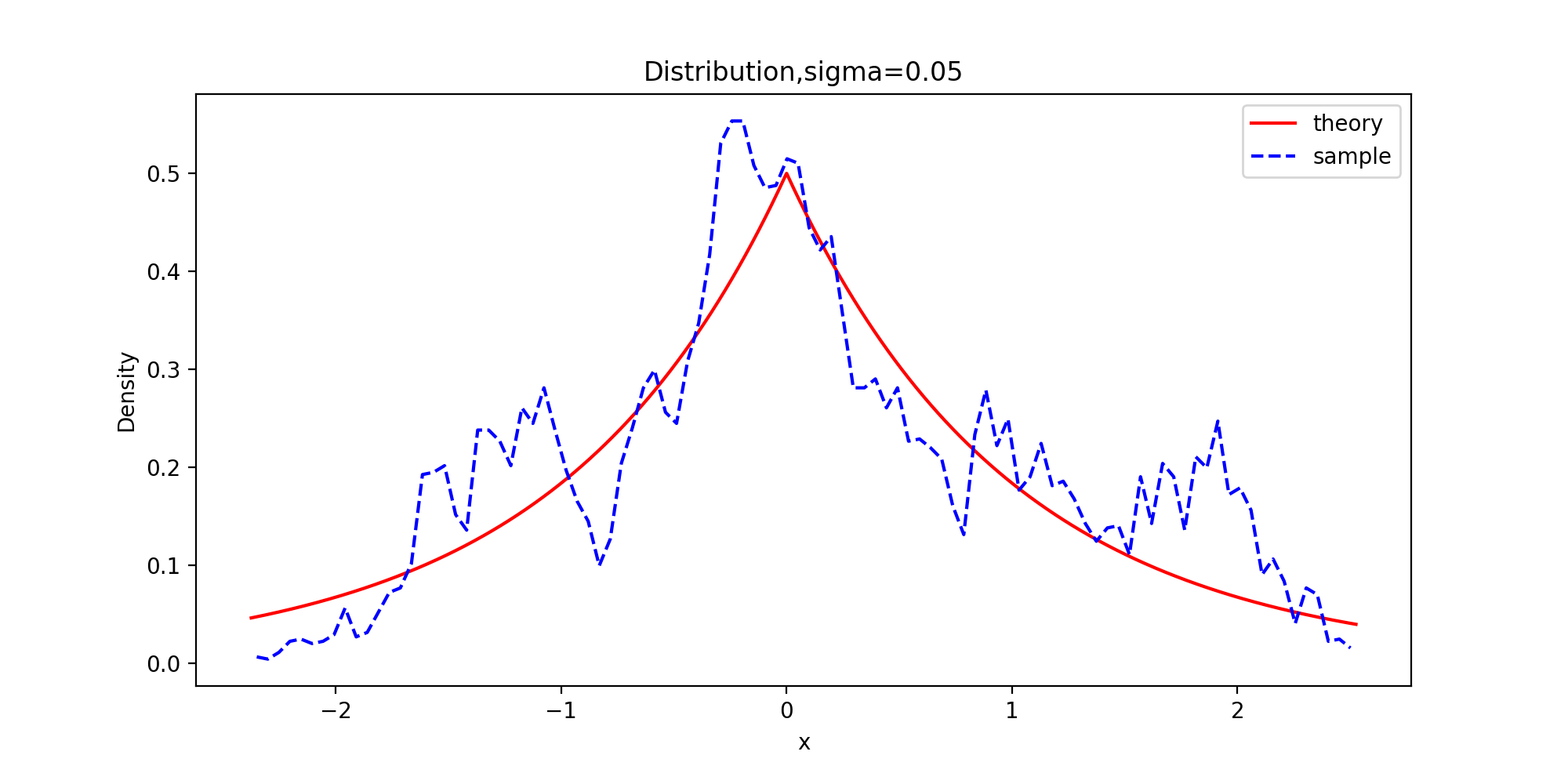
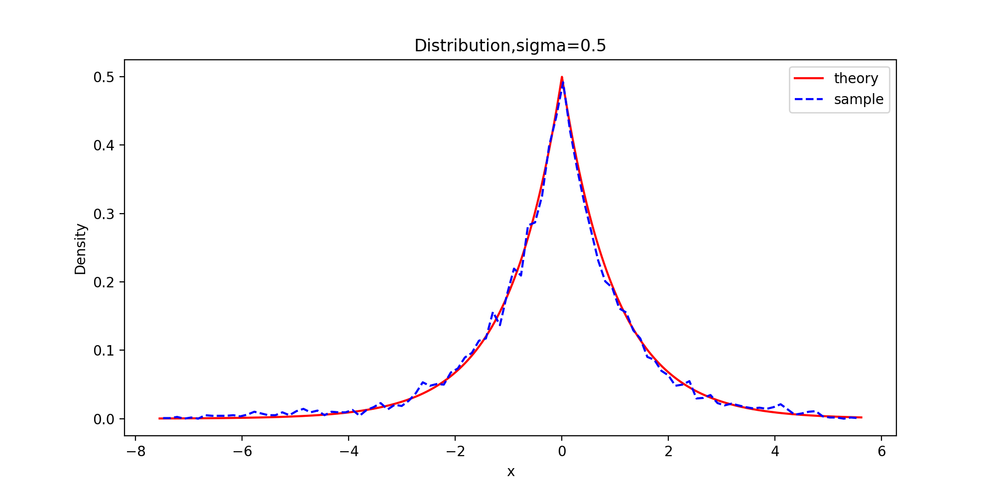
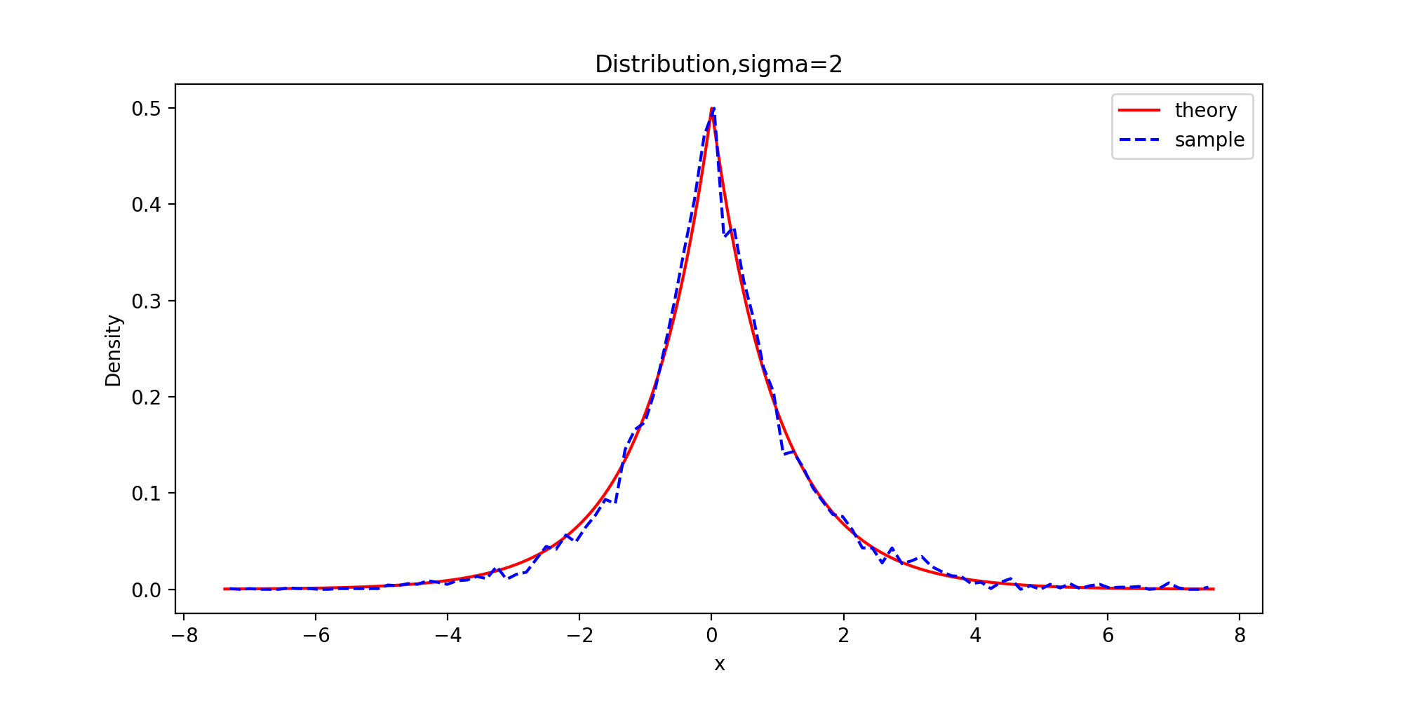
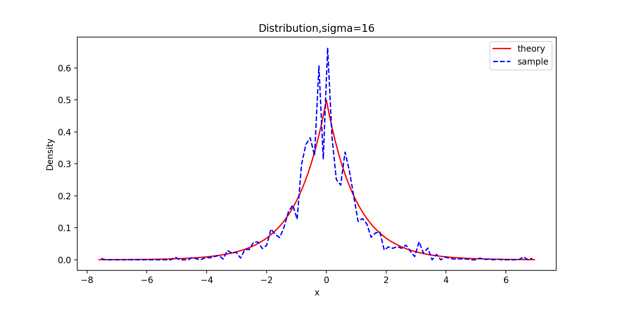
下面以拉普拉斯分布为目标分布的链生成样本和理论的密度函数曲线图
def Distribution(x, burn, f, order):
    x = x[burn:]
    tick = np.arange(x.min(), x.max(), 0.001)
    plt.figure(figsize=(10,5))
    plt.plot(tick, f.pdf(tick), color="red")
    p, y = np.histogram(x, bins=100, density=True)
    #x: 待统计数据的数组 bins:指定统计的区间个数 density为True时,返回每个区间的概率密度;为False,返回每个区间中元素的个数
    y = (y[:-1] + y[1:])/2
    plt.plot(y, p, '--b')
    plt.title('Distribution,sigma={}'.format(sigm[order]))
    plt.legend(['theory', 'sample'])
    plt.xlabel('x')
    plt.ylabel('Density')
    plt.savefig("6-{}-Distribution.png".format(order), dpi=200)
    plt.show()
Distribution(x_0, burn, f, 0)
Distribution(x_1, burn, f, 1)
Distribution(x_2, burn, f, 2)
Distribution(x_3, burn, f, 3)
运行结果:

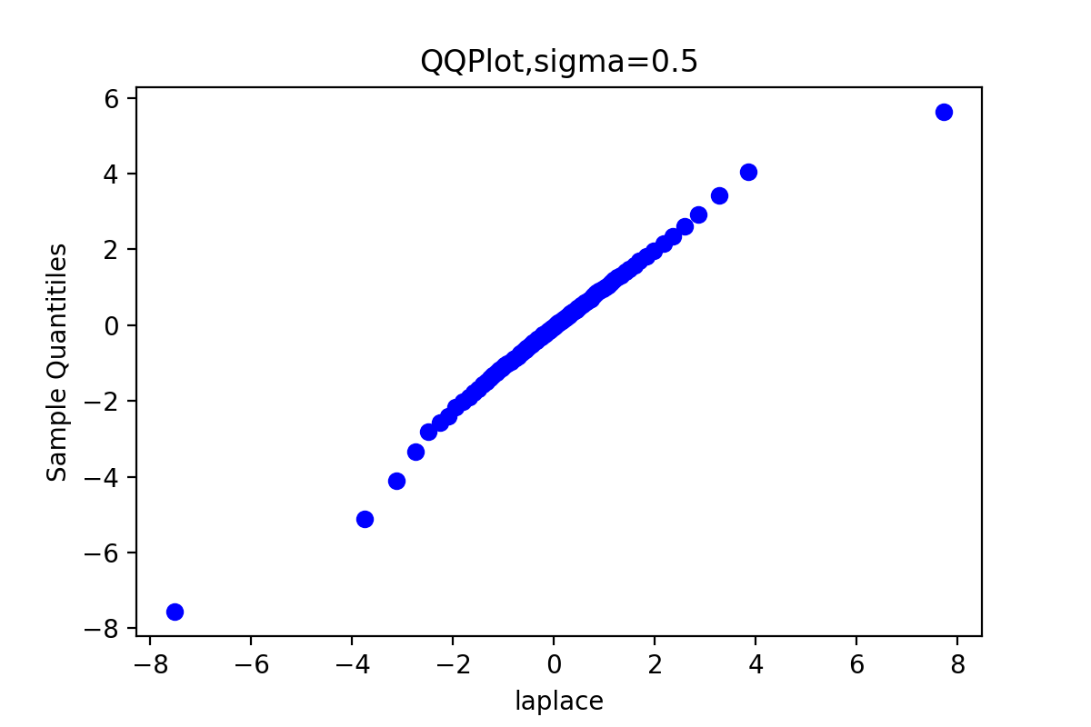
下面的代码获得比较拉普拉斯分布的理论分位数和生成链的分位数拟合程度的QQ图
def QQPlot(x, burn, order):
    x = x[burn:]
    x.sort()
    y = st.laplace.rvs(size=x.shape[0])
    y.sort()
    quantileX = [np.percentile(x, i) for i in range(101)]
    quantileY = [np.percentile(y, i) for i in range(101)]
    '''
    x: 输入数组 q: 要计算的百分位数,在 0 ~ 100 之间
    第 p 个百分位数是这样一个值,它使得至少有 p% 的数据项小于或等于这个值,且至少有 (100-p)% 的数据项大于或等于这个值。
    '''
    qua = [5, 10, 20, 30, 40, 50, 60, 70, 80, 90, 95]
    for t in qua:
        print('sigma={},样本的{}%分位数: {}'.format(sigm[order], t, quantileX[t]))
        print('sigma={},理论值的{}%分位数: {}'.format(sigm[order], t, quantileY[t]))
        print()

    plt.title('QQPlot,sigma={}'.format(sigm[order]))
    plt.scatter(quantileY, quantileX, c='blue') #散点图
    plt.xlabel('laplace')
    plt.ylabel('Sample Quantitiles')
    plt.savefig("6-{}-QQPlot.png".format(sigm[order]), dpi=200)
    plt.show()
QQPlot(x_0, burn, 0)
QQPlot(x_1, burn, 1)
QQPlot(x_2, burn, 2)
QQPlot(x_3, burn, 3)
运行结果:
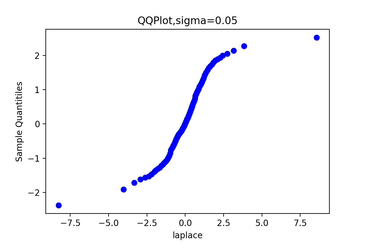
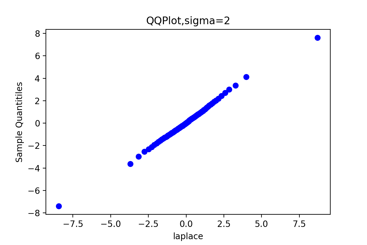
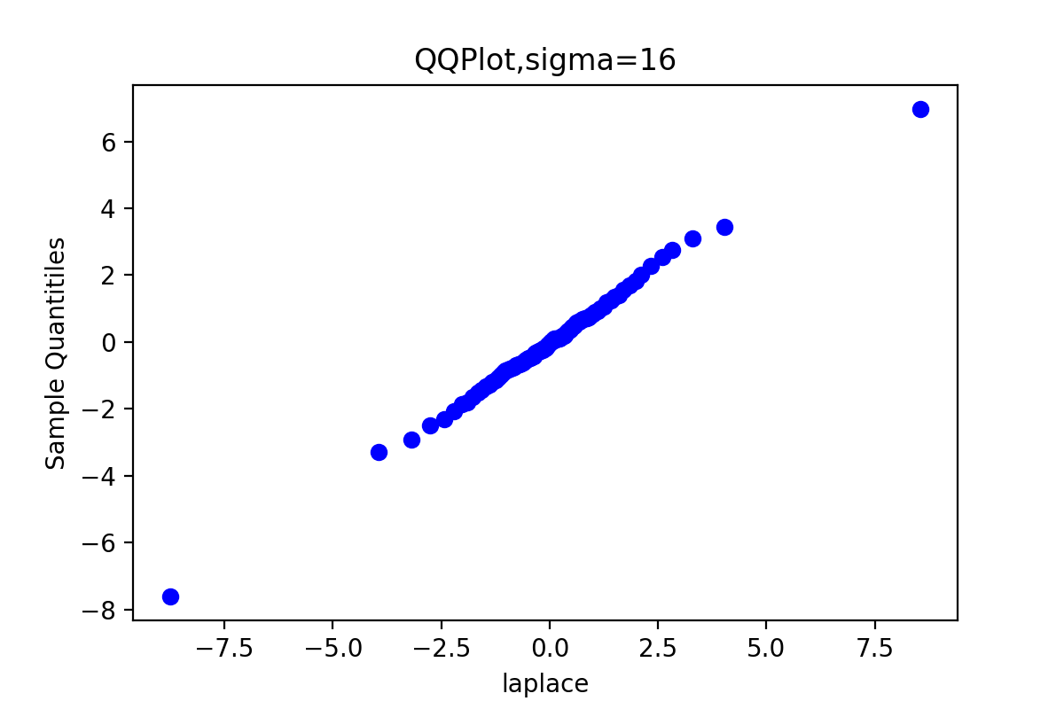
由于链3的QQ图上的点基本上集中在一条直线附近,这显示第3条链的样本分位数和理论分位数是高度近似一致的。
| Q | rw1 | rw2 | rw3 | rw4 | |
|---|---|---|---|---|---|
| 5% | -2.3510 | -4.8074 | -2.4263 | -2.1883 | -2.3118 |
| 10% | -1.6325 | -4.6624 | -1.6699 | -1.5623 | -1.5818 |
| 20% | -0.9503 | -4.3194 | -0.9229 | -0.8916 | -0.9170 |
| 30% | -0.5219 | -3.9148 | -0.5234 | -0.5427 | -0.5142 |
| 40% | -0.2398 | -3.6714 | -0.2543 | -0.2507 | -0.1945 |
| 50% | -0.0128 | -3.3250 | -0.0227 | -0.0211 | 0.0811 |
| 60% | 0.2145 | -2.7409 | 0.1859 | 0.2043 | 0.3011 |
| 70% | 0.5171 | -2.3602 | 0.4468 | 0.4661 | 0.5996 |
| 80% | 0.9622 | -1.6006 | 0.8074 | 0.8487 | 0.9563 |
| 90% | 1.6499 | -0.0249 | 1.4591 | 1.5512 | 1.6953 |
| 95% | 2.3517 | 0.4693 | 2.1449 | 2.1886 | 2.3174 |
由表可见,rw3的样本分位数与理论分位数Q比较接近。
2.3 Gibbs采样
题目:
首先导入我们所需的库
import numpy as np
import scipy.stats as st
import matplotlib.pyplot as plt
生成链的代码如下:
def Gibbs(m, f_x_y, f_y_x, a, b, n):
    x = np.zeros((2, m))
    x[0,0] = 0
    x[1,0] = f_y_x.rvs(a = x[0,0]+a, b = n-x[0,0]+b)
    for i in range(1, m):
        xt_2 = x[1, i-1]
        y_1 = f_x_y.rvs(n = n, p = xt_2)
        x[0, i] = y_1
        xt_1 = x[0, i-1]
        y_2 = f_y_x.rvs(a = xt_1+a, b = n-xt_1+b)
        x[1, i] = y_2
    return x
m = 5000
burn = 1000
a = 5
b = 20
n = 500
f_x_y = st.binom
f_y_x = st.beta
x = Gibbs(m, f_x_y, f_y_x, a, b, n)
对于Gibbs采样,所有的采样样本都接受,不存在接受、拒绝概率。同时,我们发现Gibbs抽样的过程当中可能会用到Metropolis-Hasting算法;另一方面,Gibbs抽样又是Metropolis-Hasting算法的一种特殊形式。
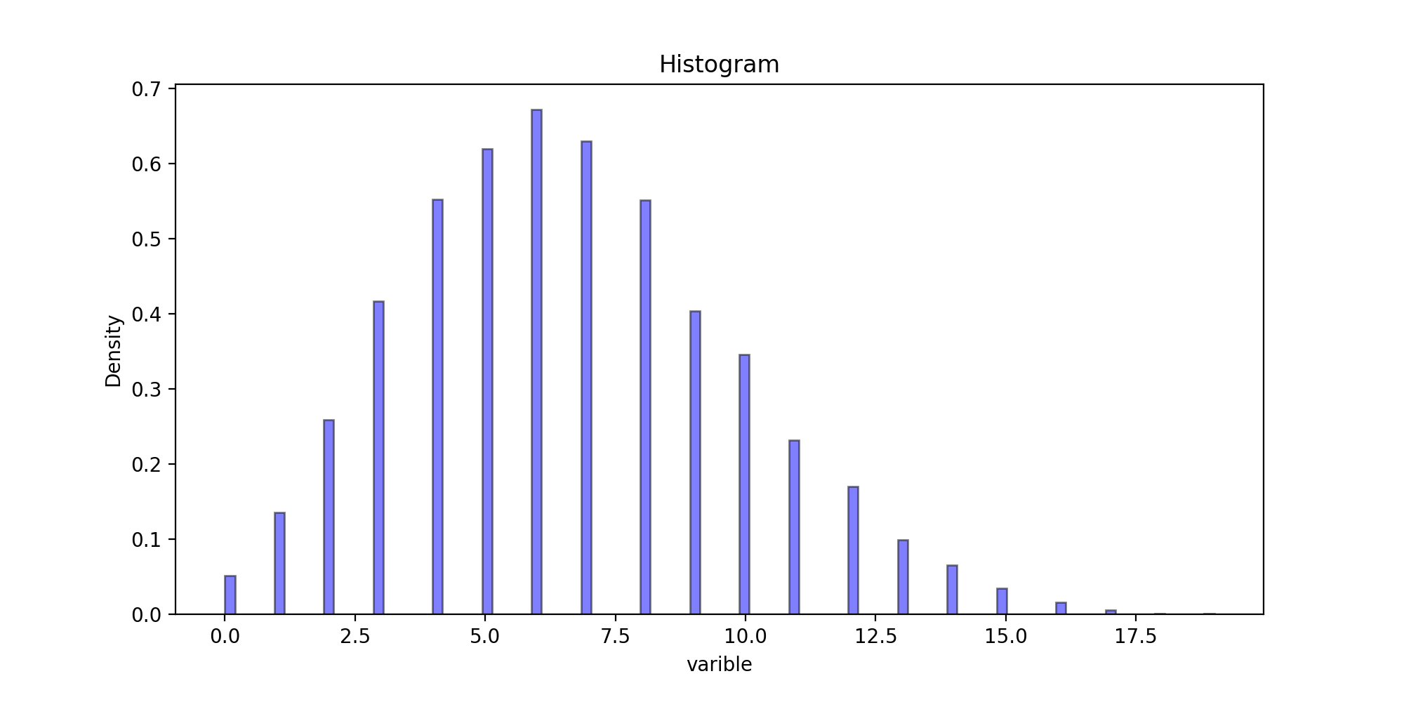
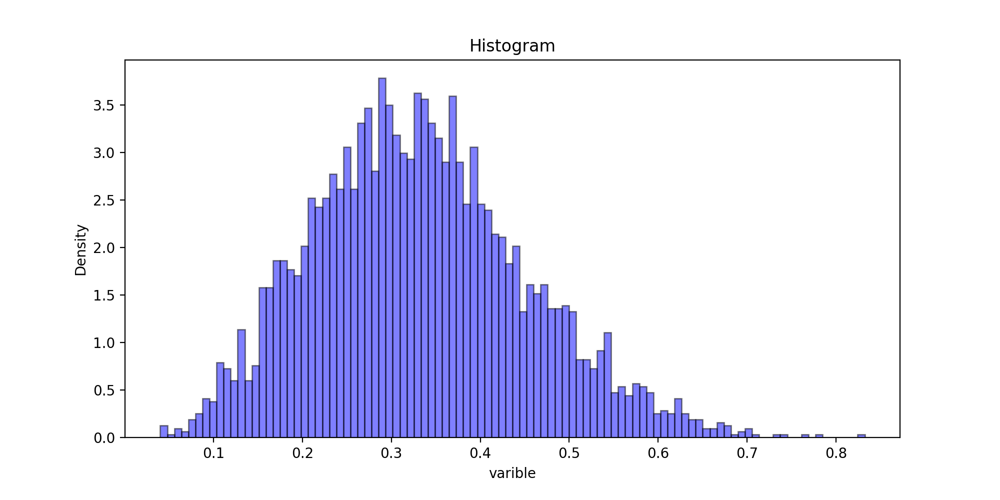
以下代码为样本直方图:
def Histogram(x, burn, astype):
    # x[0] = x[0][burn:]
    # x[1] = x[1][burn:]
    plt.figure(figsize=(10,5))
    plt.title("Histogram")
    plt.xlabel('varible')
    plt.ylabel('Density')
    plt.hist(x[astype][burn:], bins=100, color="blue", density=True, edgecolor="black", alpha=0.5)
    # plt.hist(x[astype][burn:], bins=100, color="red", density=True, edgecolor="black", alpha=0.5)
    #bins:直方图柱数 density:布尔值。如果为true,则返回的元组的第一个参数n将为频率而非默认的频数 alpha:透明度
    plt.savefig("11-{}-Histogram.png".format(astype), dpi=200)
    plt.show()
Histogram(x, burn, 0)
Histogram(x, burn, 1)
运行结果:
以下代码为二元链的散点图
def DotGraph(x, burn):
    x_t = x[0][burn:]
    #x_t.sort()
    y_t = x[1][burn:]
    #y_t.sort()
    plt.title("DotGraph")
    plt.scatter(x_t, y_t, c='blue', s=5) #散点图
    plt.xlabel('x')
    plt.ylabel('y')
    plt.savefig("11-DotGraph.png", dpi=200)
    plt.show()
DotGraph(x, burn)
运行结果:

我们发现每一次迭代中Gibbs采样中的马尔可夫链第一次沿着x方向前进一步,然后沿着y的方向前进。这展示了吉布斯采样以分成分方法一次单独为每一个变量采样。
三、实验体会
在实验之前,又重新认真看了一遍第六章的理论知识,随后通过实验,把理论运用到实践,对理论知识理解的更加透彻,梳理清了几种抽样之间的联系与区别。同时,实验过程中遇到什么问题,应该及时和老师同学们交流。希望后面的实验能继续提升自己的动手能力。